

Active tourism
Bicisenda del Oso
Context
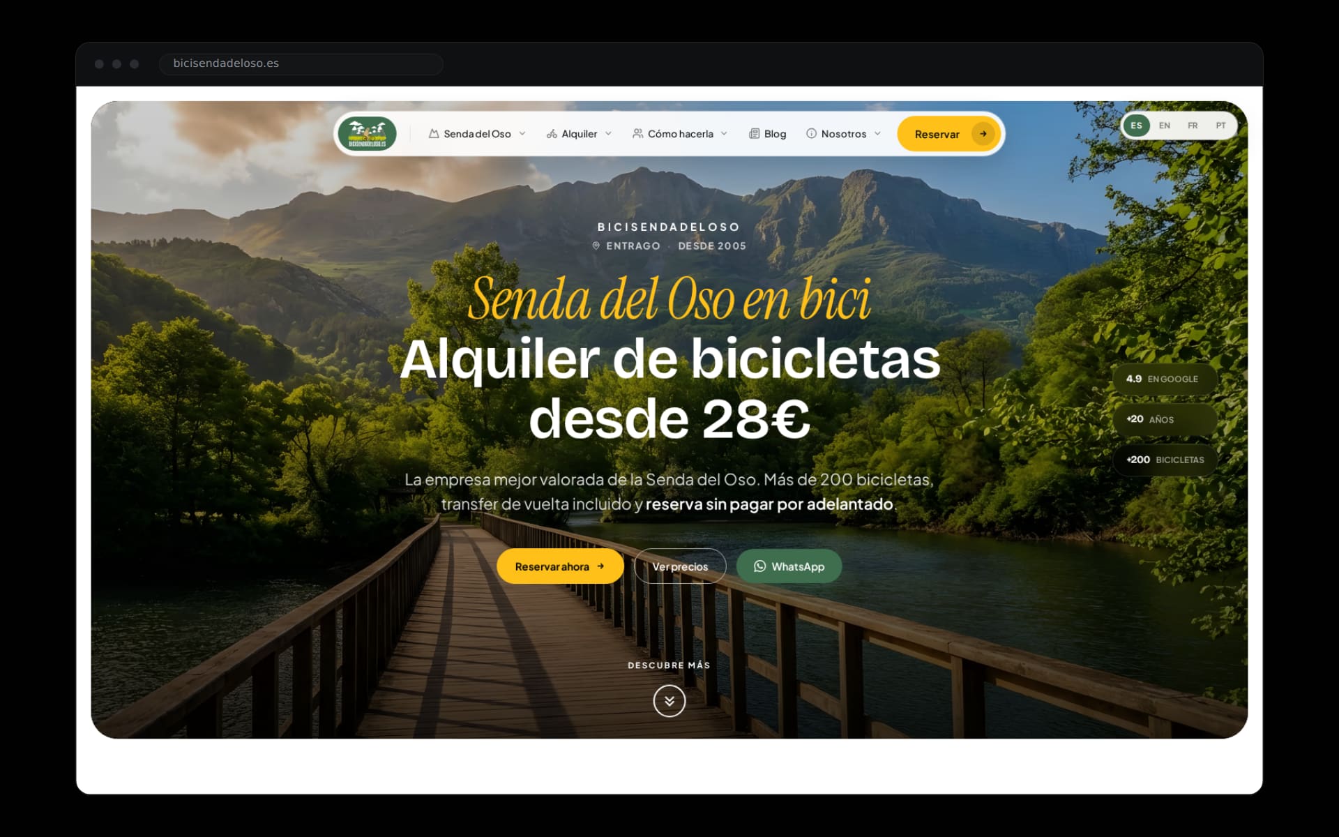
Bicisenda del Oso has rented bikes on the Senda del Oso greenway since 2005. More than 200 bikes checked daily, return transfer included, and a 4.9 Google rating built one review at a time. The business was better than its website: the old page told half the story of a July Saturday in Entrago.
Booking was the weak point. People planning the Senda del Oso compare companies on their phone, decide in minutes, and forgive neither a slow page nor a form with fine print.
The call
We treated the website like the first bike you rent: it has to work on the first try. Instead of a corporate brochure, we built the most complete guide to the greenway — where it starts, what to see, how to ride it with kids or with a dog — with booking always one tap away.
One rule governed every screen: the boldest policy in the business, booking without paying upfront, had to be seen before it was read.
Execution
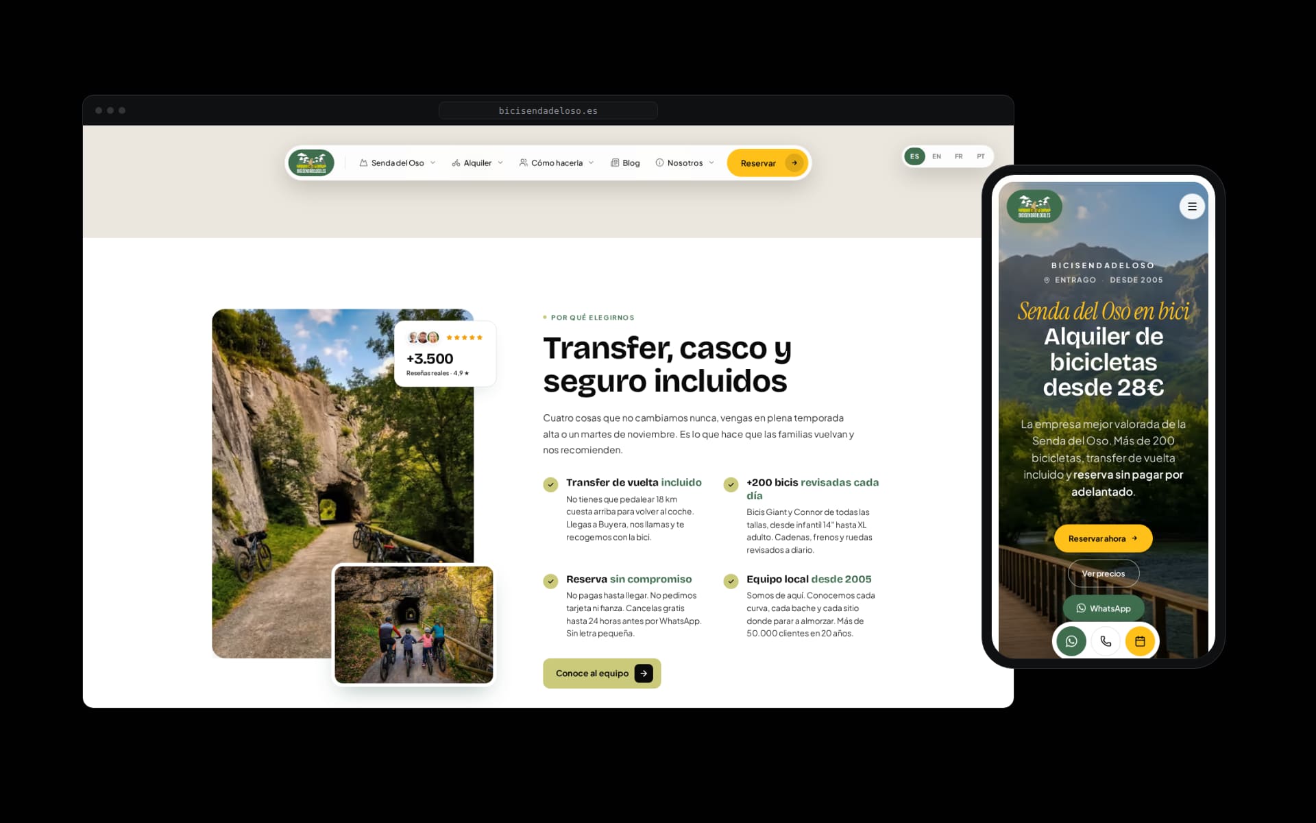
We rebuilt identity and website from the ground up: art direction, a type system, a content architecture in four languages, and a booking flow that works by web, phone or WhatsApp with no card involved. Every page answers a real question from someone about to ride.
Underneath, deliberately boring engineering: light HTML, images served to the exact screen, technical SEO and structured data. The result loads in under 2 seconds on an ordinary phone, in the middle of the valley.
Results
Green Core Web Vitals, an instant first impression, and a booking that completes in under a minute. The content ranks for the searches that surround the Senda del Oso and answers questions before the counter phone rings.
The site is live at bicisendadeloso.es. The 3,500-plus reviews belong to the team in Entrago; our job was building a website that deserves them.