

Personal training
Refuerzo Muscular
Context
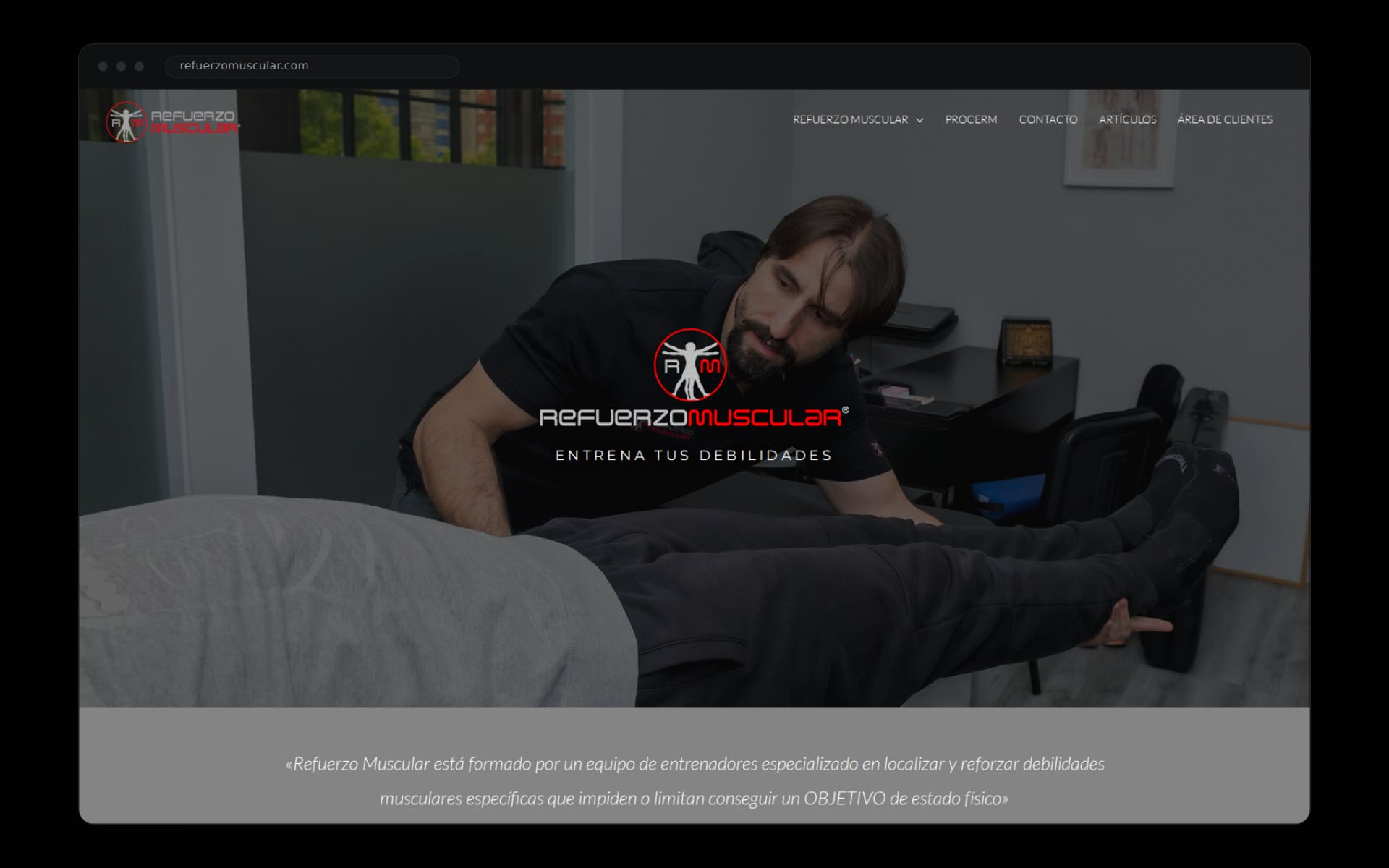
Refuerzo Muscular is not a gym. It is a team of trainers in Avilés specialised in locating and strengthening the muscle weaknesses that block a goal: training again after an injury, living without pain, looking better or passing a physical test. Their motto sums it up: a chain is as strong as its weakest link.
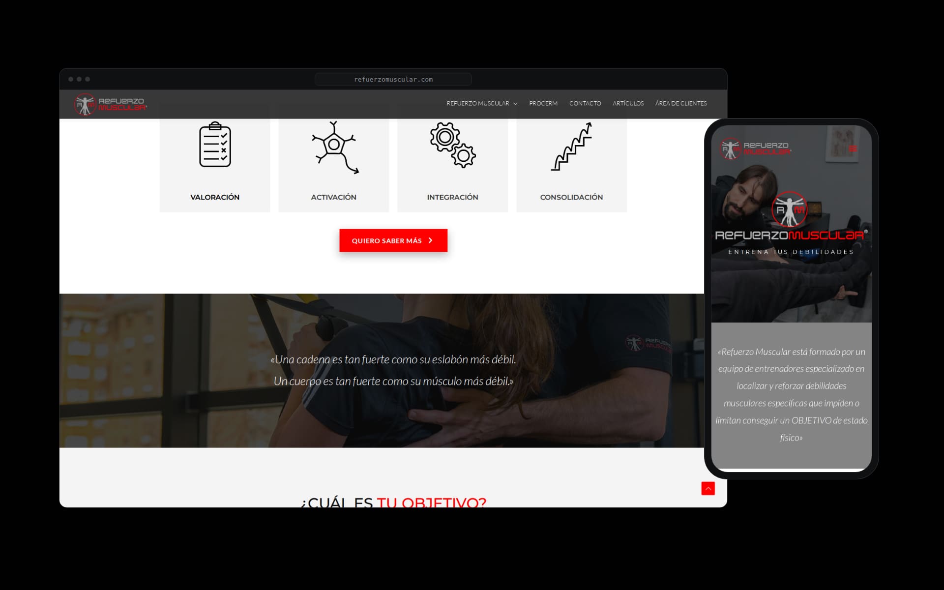
A serious method — assessment, activation, integration, consolidation — needed a digital presence that matched it, not one that confused it with another fitness franchise.
The call
We designed the site around the method, not the facilities. No machine galleries: the protagonist is the procedure, and every visitor finds themselves behind one of four doors — rehabilitation, wellbeing, aesthetics, physical preparation — each with its own path.
The brand follows suit: the Vitruvian figure of the logo, red on black, treated with the restraint of a clinic and the energy of a training floor.
Execution
We built applied identity and the full website: visual system, a content architecture that explains the method phase by phase, team profiles, straight prices and direct contact. UX designed for someone arriving with pain or with a goal, not with an appetite for browsing.
The technical layer is tight: light pages, images cut to size, technical SEO and structured data. The result doubles the speed of the previous site and moves comfortably on any phone.
Results
A site that filters and orders: every visitor understands in seconds whether Refuerzo Muscular is for them and where to start. Enquiries arrive with the goal already worded, and the first assessment begins before anyone sets foot in the centre.
The site is live at refuerzomuscular.com. The weak link, this time, was not muscular.